Bridging gaps in digital accessibility with a mobile app
Accessibility is for everyone
Social media is more than memes and cat videos. It’s also where communities can connect and organize. When Hurricane Helene devastated the southeastern U.S., social media was a resource for both people who were displaced and people who wanted to find a way to help.
There were so many graphics circulating with information but they weren’t all accessible. Even if it grabbed someone’s attention to stop scrolling, it was hard to read and easy to miss information if there was poor color contrast or small or crowded text. I wanted to create an app where anyone can make a graphic design that’s accessible and can be read by everyone.
| Role | UX/UI Designer, UX Researcher |
|---|---|
| Scope | End-to-end app (Student project) |
| Tools | Figma, Miro, Airtable |
| Timeline | 98 hours |
Ready, set, action
Research Plan
Defining the goal & scope
From the start, I decided the scope of this project is graphic design for social media posts to keep the process focused.
Research goal
We want to understand people’s challenges, needs, and wants with accessibility and social media graphic design, so that we can create a mobile app that helps users improve their design’s accessibility.
What are existing apps doing?
Since my product was at the intersection of accessibility and design, I looked at competitors in both of those areas.
The competitors

Stark
End-to-end platform to streamline your accessibility workflow.
Color contrast
Instant accessibility check for iOs and macOS.
canva
A graphic design tool with 1,000,000+ templates & graphics.
adobe express
An all-in-one design, photo, & video tool for easy content creation.
Findings
- Target market: While Adobe Express and Canva are marketed as tools for anyone to use, Stark and Color Contrast are targeted to Designers and Developers to make sure an app or website is compliant with Web Content Accessibility Guidelines (WCAG).
- AI features: Both design apps have a generative AI feature but the designs can be basic and generic. Stark has a paywalled AI feature that makes it quicker and easier to check and fix accessibility issues.
- Complete package: Both Stark and Canva think about users’ needs in a comprehensive way. Stark thinks about the entire team and workflow from Designer to Product Manager. Canva thinks of the different types of marketing assets people would need to produce.
What do users think?
I conducted five 30-minute interviews to understand how people design, what people think about accessibility, and how people combine accessibility and design.
My participant criteria was anyone who has done graphic design that was shared on social media, whether it was in a professional capacity or not. Out of my 5 participants, only 1 was a Graphic Designer for work and the others did it for personal projects.
I have an assumption 👀
Because I didn’t learn about accessibility resources and checkers until I came into UX design, I had an assumption about how people discover accessibility checkers.
Assumption
People only learn about accessibility checkers in a professional context.
My competitor analysis was starting to validate this assumption with who they marketed accessibility apps to, so I was curious about other people’s experience with these tools.
Uncovering people’s mindset
Interview insights
Accessibility’s important but not always practiced
People care about accessibility because it considers everyone’s needs, including people with disabilities, but they don’t always make it a priority.
“I’m not always thorough about checking accessibility of colors & font sizes.”
“In the past, I’ve used alt text with Instagram but I haven’t been super consistent with it.”
“With poor color contrast, I do or don’t change it depending on how functional I’m being.”
Why?
Nobody mentioned compliance with accessibility laws as a reason for accessibility’s importance. If people care about accessibility because they want to, why isn’t it always prioritized?
People forget about accessibility
It isn’t a lived experience for some people.
4 participants voluntarily shared they don’t identify as disabled. Because accessibility isn’t something they need in navigating the world, it can be an afterthought.
There’s a lack of awareness with disability.
People feel like they don’t hear about accessibility often to think about it regularly or see it being practiced to have clear guidance on how to integrate it into their process.
Accessibility feels like an extra step
It’s another checklist to remember.
It’s difficult to remember all of the accessibility things to keep track of and people are unsure if they’re even considering everything.
It can be a time-consuming process.
It can be a tedious process to review results from an accessibility checker, select accessible colors and fonts, and write alt text for a post.
How did people learn about accessibility checkers?
Circling back to my assumption, 4 out of 5 participants learned about accessibility checkers from their jobs or education in design or tech. The 5th participant did not know of any and has zero work experience or education in those industries.
Software Engineer
Graphic Designer
Design education
No tech background
If people encounter accessibility checkers through their career and if they’re marketed to certain roles, it’s not surprising there’s a lack of awareness around it since it’s limited to that sphere.
The world only thinks about accessibility sometimes
Where I live in Philadelphia, only some subway stops, restaurants, and stores are wheelchair accessible. Unfortunately, this isn’t unique to Philly. The world only considers people with disabilities sometimes, so our digital experiences mirror that too.
Finding a clear direction
Research Synthesis
The target users
I wanted my app to go beyond professional contexts and be for everyone, so I created 2 personas: one who does graphic design for work and one who does it for personal projects.
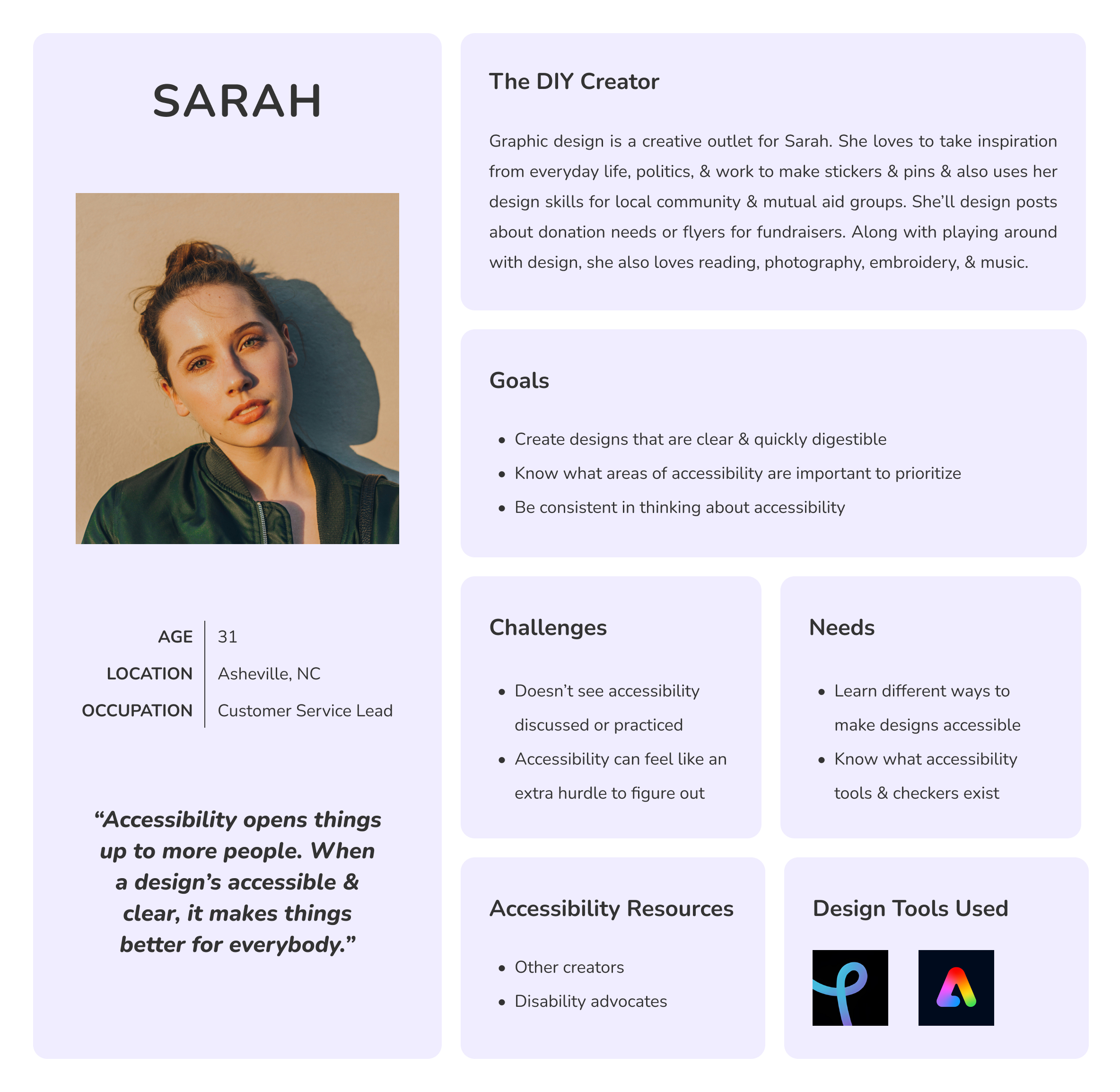
The DIY Creator
Sarah is my primary persona. She has learned graphic design on her own with free design tools and uses her skills for community groups and personal art projects.
She cares about accessibility from a disability justice standpoint and includes image descriptions in social media posts when she can. However, she doesn’t know of any accessibility checkers and what’s important with accessibility in design.
The Professional Creative
My secondary persona is Casey, who has a career in graphic design and sometimes lends her skills to projects for friends and family.
She knows of accessibility guidelines and general best practices for accessibility but doesn’t feel like it’s incorporated into her design process. When there’s already a lot to consider with a design, accessibility feels like another checklist to run through.

The right problem & question
With my interview insights and defined target users, I pinpointed the problem and flipped it into a how-might-we (HMW) question to inspire a user-centered solution.
Problem statement
As someone who designs, I need easy ways to check my designs for accessibility because it’s not always front of mind, so that I know my design can be understood and enjoyed by everyone.
HMW question
How might we provide easy accessibility solutions to professional and non-professional graphic designers to build an accessibility-first approach to design?
Building the solution
Ideate
Prioritizing features
The core features of the app are checking graphic designs for accessibility and fixing accessibility issues. As an accessibility tool with a learning aspect, the app scans a design the user uploads and offers accessibility solutions rather than create one with a generative AI feature.
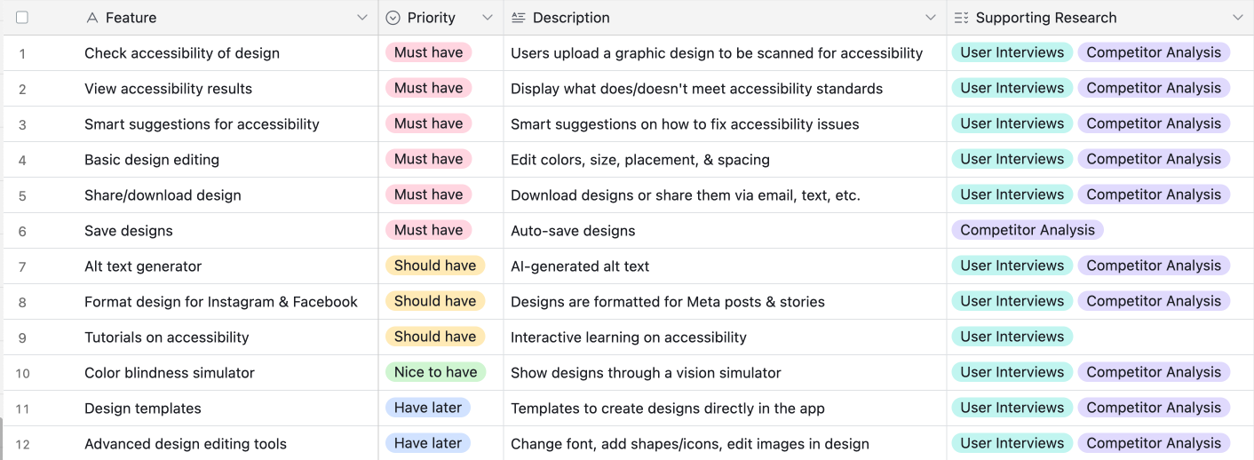
With my ‘should have’ features, I thought about my competitor analysis and how Stark and Canva had a 360-degree view of their users’ needs. Since this is for social media graphic design, I included features to format designs and generate alt text so users can easily take their accessible design and post it on social media. I also included tutorials to build off of the learning aspect.
Clearing a path for users
I created these 3 task flows around the main features of the app: design, alt text, and tutorials.
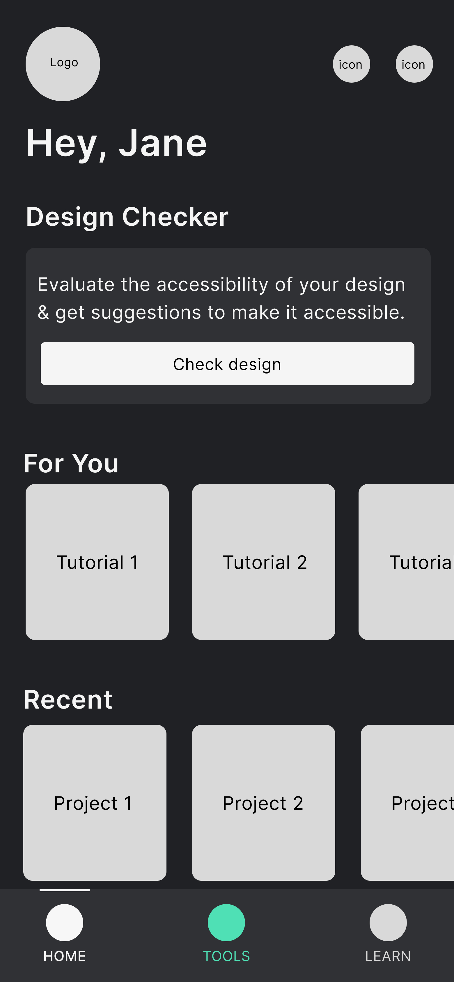
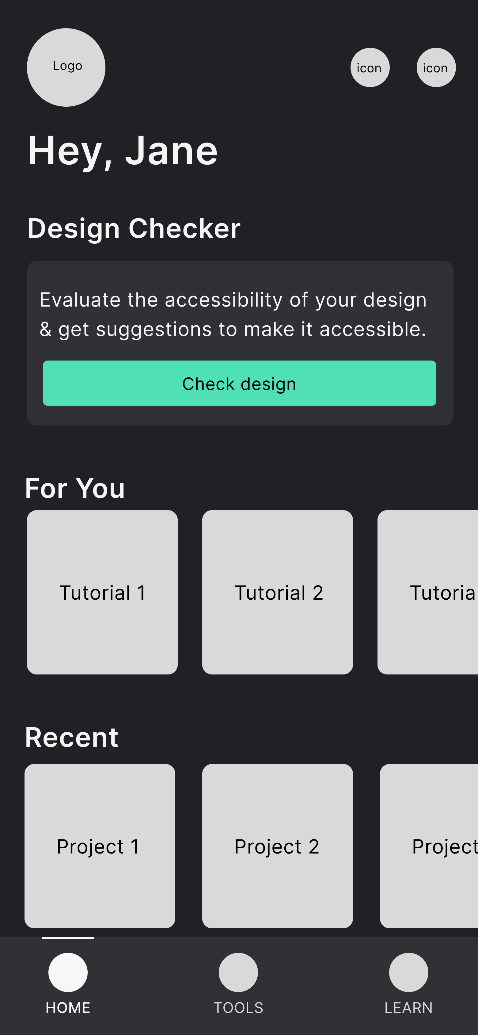
Check, fix, & format design
For the accessibility checker, users will upload their design to see their accessibility results, fix any issues, then format the updated accessible design.

Create alt text
After some back and forth on this, I decided the alt text generator can be used without the accessibility checker. While I want all designs to be accessible, I didn’t want to create barriers for users and force accessibility compliance. Instead, at the end of this flow, there would be a modal that suggests using the checker if a user hasn’t already done so.

Complete tutorial
One of the tutorials will be an interactive tutorial to learn about color contrast, WCAG, and complete a short quiz at the end.

Sketching key screens
I sketched my low-fidelity wireframes to brainstorm some of the key screens.
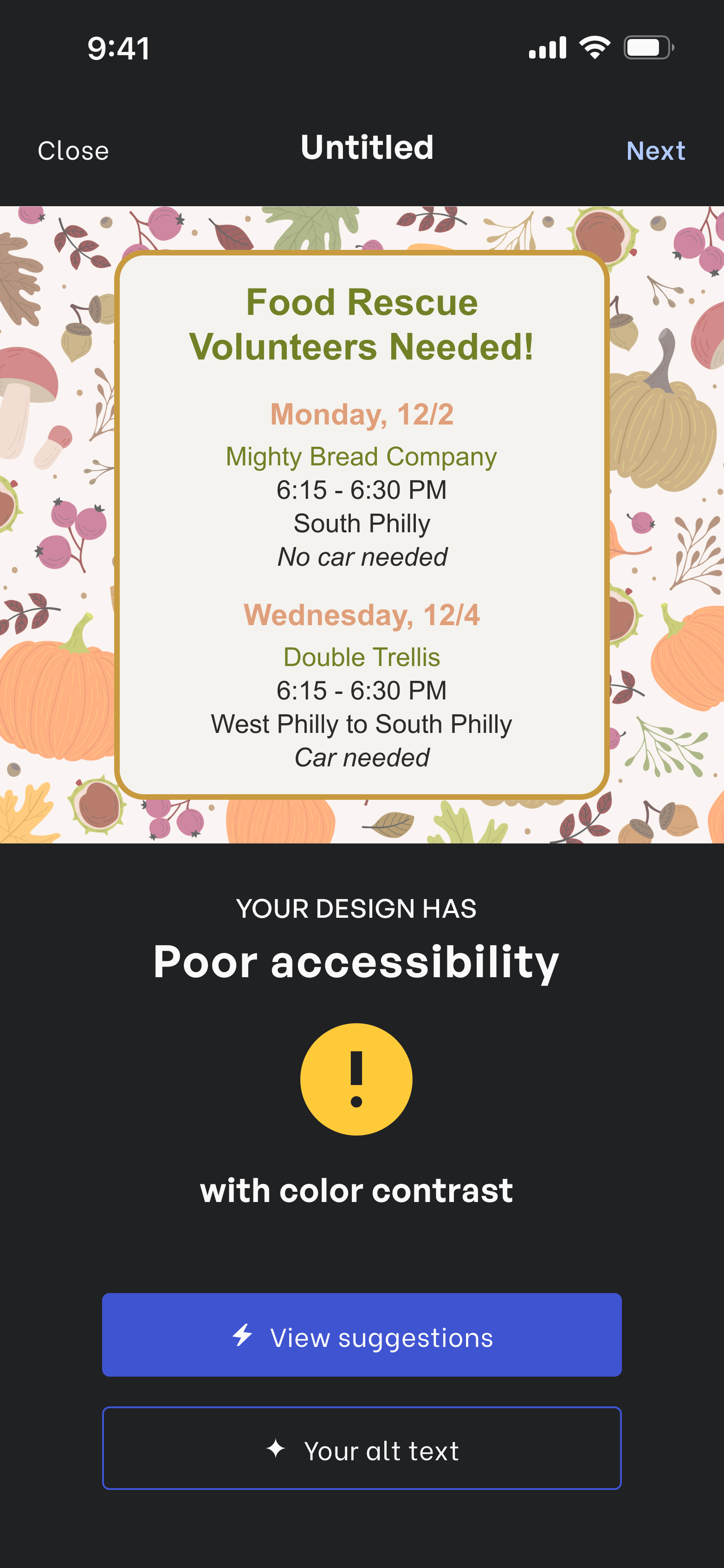
Accessibility checker
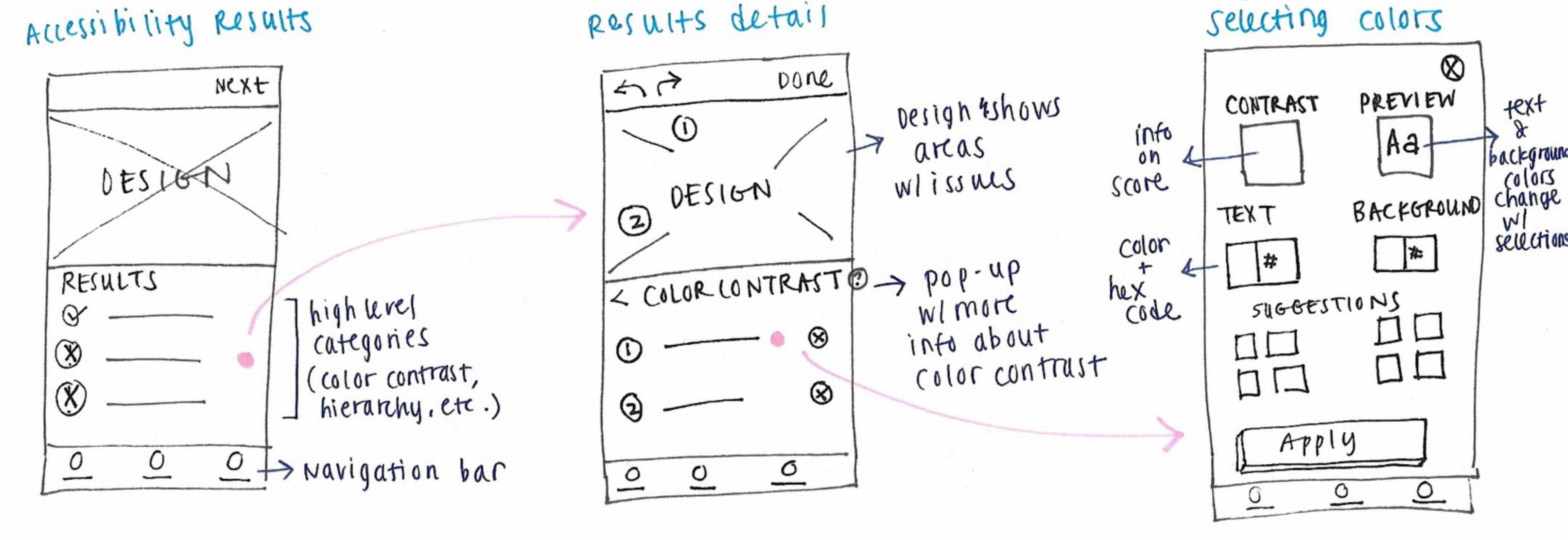
I explored how to display poor color contrast results and suggestions to fix it.
Alt text generator
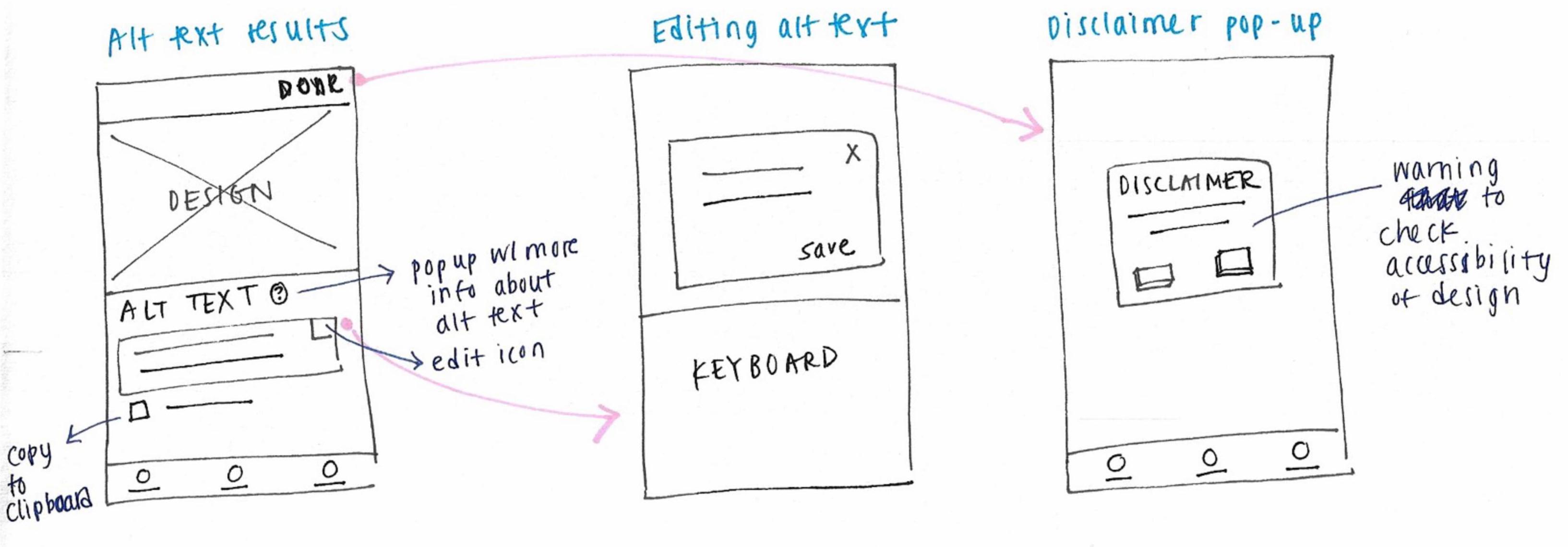
For the alt text, I tried to find ways to keep the format and headers similar to the accessibility checker.
Coloring in the brand
Branding
What does the brand mean to users?
When coming up with brand values, I thought about what this app is. It’s there to help people build accessible practices and open them up in thinking about disabled people’s needs.
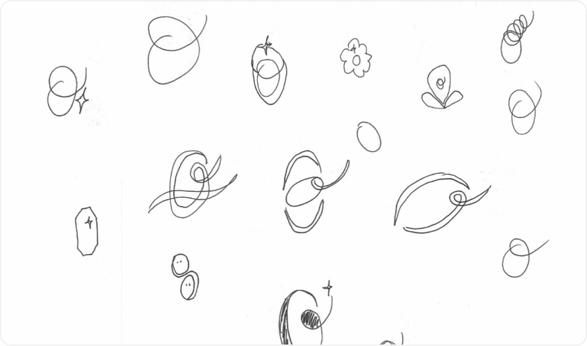
I brainstormed a list of adjectives, placed them on a diagram, and narrowed down my choices until I landed on these brand values: illuminating, thoughtful, open, and ease.

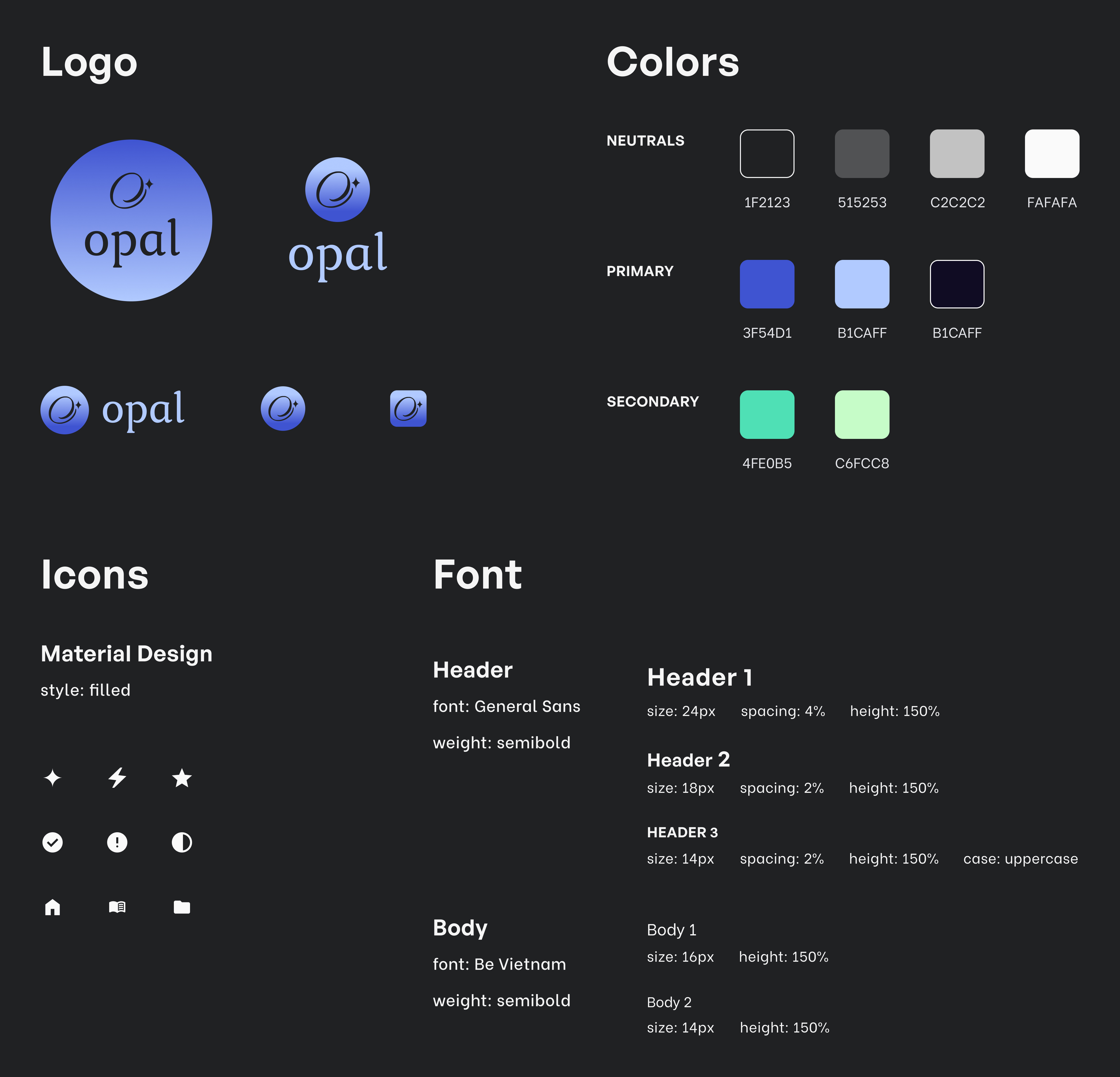
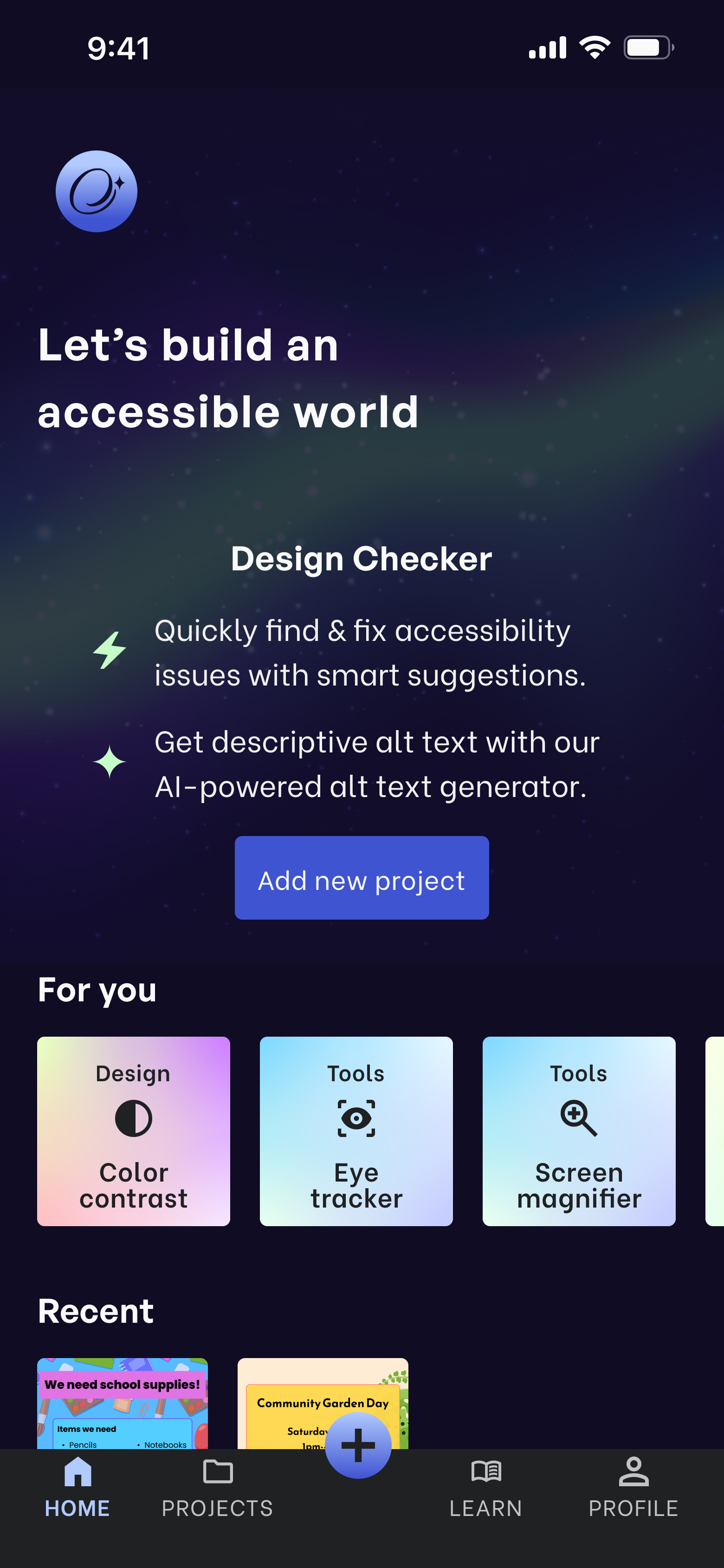
Name reveal: Opal

The inspiration
Thinking about how the app draws people in to accessibility, I took inspiration from the northern lights for my colors and named the app after an iridescent stone, opal.
Logo exploration
I explored different versions of an O and a star for the logo. I wanted it to give a sense that it’s enjoyable and delightful to use for accessibility and feel a bit whimsical.
Bringing the brand to life
I landed on this as my final logo since it gives a sense of movement and arrival at a place and made final style choices that added to the brand’s inviting and pleasant feel.
The 3 R’s: Revise, revise, revise
Design
A 0% task completion rate
Once I had my mid-fidelity wireframes, I conducted an unmoderated usability test with 5 participants to test my 3 task flows and I got surprising results.
For the task to create alt text, none of my participants completed the task! After the moment of panic passed, I thought about what was confusing or unclear to all participants.
What I expected
I expected users to see that the Design Checker was not what they needed, go to the navigation to click on Tools, then find the option to create alt text.
What happened & why
Instead, users clicked on the Design Checker. There wasn’t enough of a distinction between that and the alt text tool, so people didn’t want to explore to find something else.
Another design problem
As I thought about different use cases, I came across another problem: if the 2 tools are separate, how does that work for users who want to use both?
An easy fix could’ve been presenting the option at the end of one flow to use the other tool, but it would’ve made users feel like the app is an endless series of decisions and screens.
Feeding 2 birds with 1 scone
Home
Upload

Results
I decided to combine them so that after uploading a design, users would see a screen with both the accessibility results and alt text so they can still choose one or the other or both.
Another area that confused everyone
For my high-fidelity wireframes, I did a moderated usability test with 6 participants for 3 tasks:
- Add a project and fix accessibility issues
- View and copy alt text then format design for Instagram
- Complete the color contrast tutorial
However, there was another area that confused 100% of participants—the Next button.
Before
It wasn’t clear what the entire flow was to users and that ‘Next’ would take them to resizing their design for social media.
After
Since users may not even need to resize and just want to download it as is, I changed it to a ‘More’ button to present all options to users.
Answering my HMW
Beyond the app’s feature, how was I providing easy accessibility solutions to my target users?
Clear results, options, & language
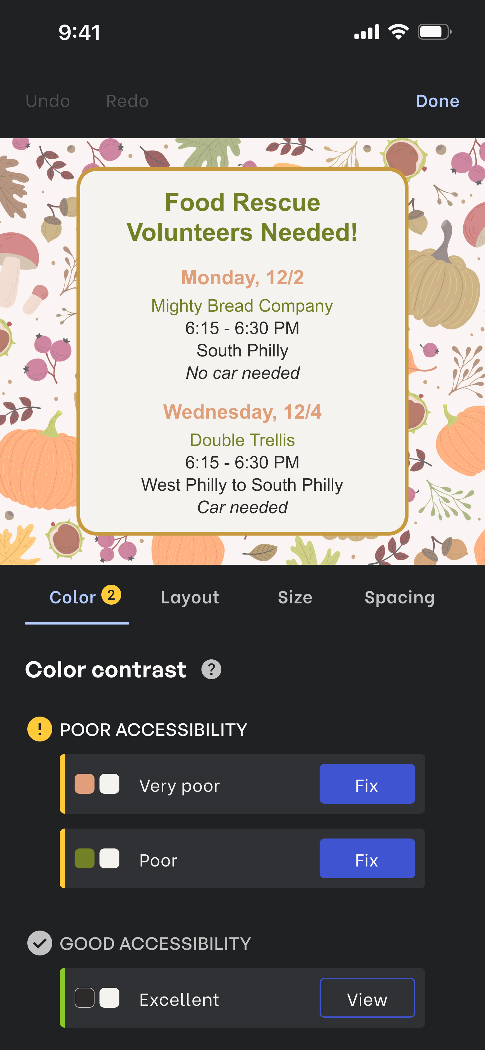
Poor contrast

Fixing contrast
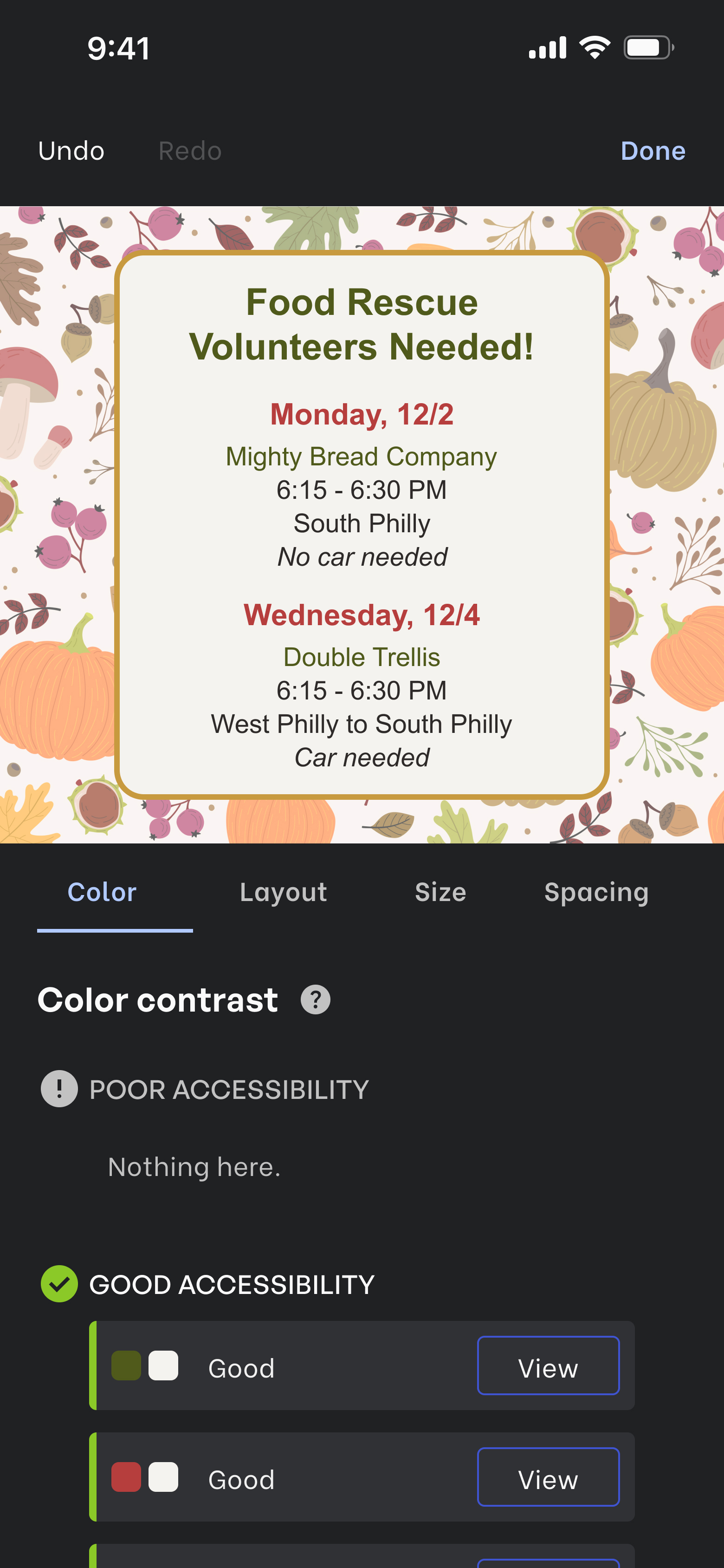
Good contrast
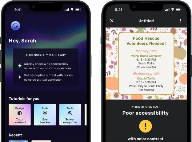
I relied on a mix of colors, icons, and grouping to display information and actions to users. I chose a star rating system with language like poor and good to rate color contrast since a color contrast ratio would be unclear to users who didn’t work in design.
One of the pain points users have with accessibility checkers was how tedious it can be selecting the right colors. To address this, I included a preview of colors as users explore options and an undo and redo button to easily go back and forth between changes.
The big reveal
Prototype
Introducing: Opal
Accessibility is for everyone meaning people with disabilities can use, access, and enjoy everything and also that everyone and not just disabled people should be thinking about it too.
This app allows anyone who creates graphics and posts them on social media to easily make their designs and posts accessible with an accessibility checker and alt text generator. It’s also a resource for people to learn more about accessibility and the needs of disabled people.
Check design
Check your design by adding a new project and fixing accessibility issues.
Alt text
Prep for a social media post by copying alt text and resizing for Instagram.
Tutorial
Learn more about color contrast and complete the color contrast tutorial.
Try prototype
Go to FigmaTakeaways
There’s a lot I’m taking away from this project not only in my skills as a UX Designer but in thinking about accessibility and the industry.
Always acknowledge & validate assumptions
In the research phase, I was intentional about acknowledging and validating my assumptions but wasn’t as diligent about this in the design phase. My usability tests had all participants get stuck at the same points, which showed I didn’t step back enough to think from a user’s point of view.
Go deeper on task flows with use cases
As I designed each screen, I kept thinking of different tasks and interactions a user would want to do. I needed to go deeper on my task flows and think of multiple use cases to have a clearer and more complete picture of users’ interactions and what I needed to consider.
Be proactive in learning about accessibility
This project helped to grow my own understanding of accessibility and deepen my commitment to it. I’ve also had to get honest with myself that as a non-disabled person and a UX Designer, I need to be much more proactive in thinking and learning about accessibility and sharing that with others.